


Improving User Experience: Key Aspects of Mobile Optimization in WordPress
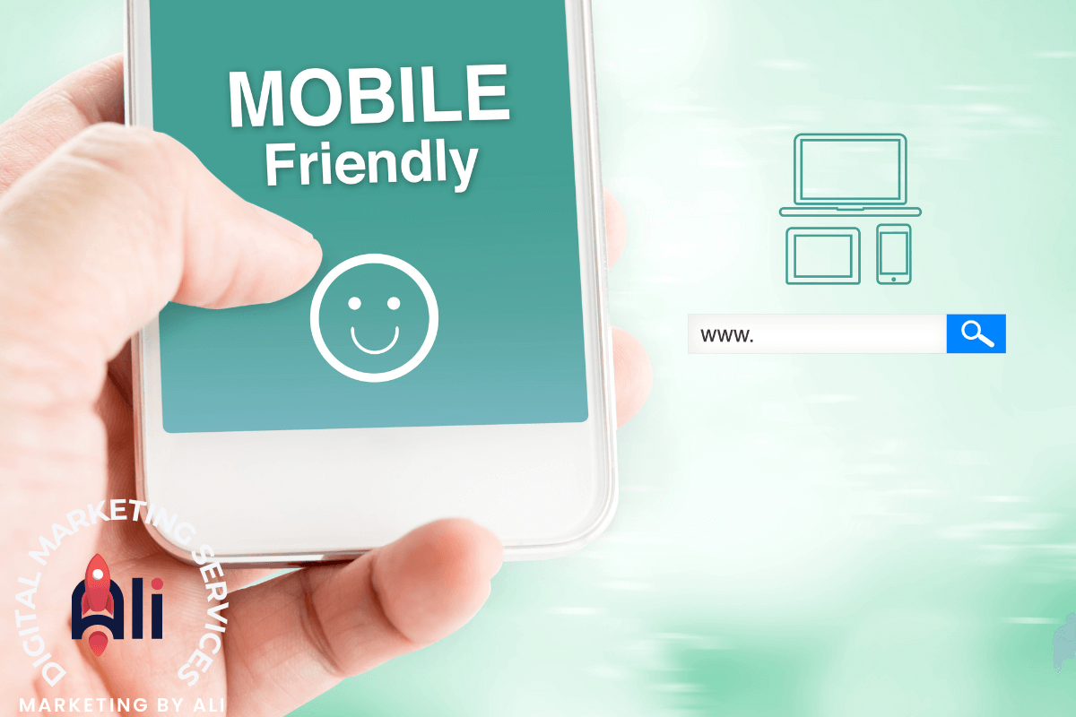
WordPress mobile-friendly design
In today’s digital landscape, where mobile devices have become the primary medium for accessing the internet, optimizing your website for mobile users is no longer optional—it’s essential. As the world’s leading content management system (CMS), WordPress offers many tools and techniques to ensure your website provides a seamless experience across all devices. In this article, we’ll delve into the key aspects of mobile optimization in WordPress and how they can significantly enhance user experience.
- Responsive Design: Responsive design is the foundation of mobile optimization. A responsive WordPress theme automatically adjusts the layout and content of your website to fit different screen sizes, ensuring an optimal viewing experience across various devices, including smartphones and tablets. When selecting a theme for your WordPress site, prioritize responsiveness to cater to the diverse needs of your audience.
- Mobile-Friendly Plugins: WordPress boasts an extensive library of plugins that can further enhance mobile optimization. Look for plugins specifically designed to improve mobile performance, such as WP Touch, which creates a mobile-friendly version of your website, or WP Mobile Menu, which enables you to customize the mobile menu for better navigation on smaller screens. These plugins can streamline the user experience and make your site more accessible on mobile devices.
- Optimized Media Content: Large images and videos can significantly slow your website’s loading time on mobile devices, leading to a poor user experience. To mitigate this issue, optimize your media content for mobile consumption. Use image compression tools to reduce file sizes without compromising quality, and consider implementing lazy loading to defer the loading of offscreen images and videos until they’re needed. By optimizing media content, you can ensure faster load times and smoother browsing experiences for mobile users.
- Touch-Friendly Navigation: Navigating a website on a touchscreen device differs from using a traditional mouse and keyboard. To accommodate mobile users, prioritize touch-friendly navigation elements on your WordPress site. This includes larger buttons and links that are easy to tap and intuitive gestures such as swiping and scrolling. By optimizing navigation for touchscreen interaction, you can minimize user frustration and encourage engagement on mobile devices.
- Fast Loading Speeds: Mobile users expect websites to load quickly; even a few seconds of delay can lead to high bounce rates. To optimize loading speeds on WordPress, leverage caching plugins to store static versions of your site’s pages and reduce server response times. Additionally, minimize HTTP requests by combining and minifying CSS and JavaScript files and utilize content delivery networks (CDNs) to deliver content to users more efficiently. By prioritizing fast loading speeds, you can provide a smoother browsing experience for mobile visitors.
- Optimized Typography: Legible typography is crucial for mobile optimization, as small screens can make text difficult to read if not properly formatted. Choose fonts that are easy to read on mobile devices and maintain a comfortable font size for optimal readability. Avoid overcrowding pages with text; use ample white space to enhance readability and visual appeal. By optimizing typography for mobile viewing, you can ensure that your content remains accessible and engaging across all devices.
Conclusion:
Mobile optimization is paramount for providing a seamless user experience and maximizing the reach of your WordPress website. By implementing responsive design, leveraging mobile-friendly plugins, optimizing media content, prioritizing touch-friendly navigation, ensuring fast loading speeds, and optimizing typography, you can create a mobile-friendly website that delights users and drives engagement. Stay proactive in monitoring your site’s mobile performance and adjust as needed to keep pace with evolving user expectations in the mobile era.
We want to help take your firm to the next level. That starts with a conversation so we can understand your objectives, where you are currently, and where you want to be, and, working together, we can determine a plan and services that are right for you to make your business a success.
